
To stay ahead, you need to keep an eye on the best people in your field. Each website on this list is a great example of how to make a SaaS website that works perfectly and looks great at the same time.
These SaaS websites are great for anyone interested in startups, business, or just exploring the digital world. They have a loHow to Do Itul information, creative ideas, and the newest ways to solve problems.
What makes a SaaS website work?
Have you ever thought about what makes a great SaaS site?
It's all about how the users feel.
The best saas website design is one that has everything you need in one place, looks great, and makes your life easier.
Their message is clear, their style is great, and they really sell something. We'll break down the magic recipe in this part.
Get ready to find out what makes the best the best.
16 of the best examples of SaaS websites to get ideas from

1. Webflow
Changing the way websites are designed and built
Webflow stands out among the best SaaS websites because it gives you a lot of design freedom and no-code features. Its website, which has a user-centered design and lots of tools, is similar to this new idea.

Navbar
The navbar in Webflow shows how much the company cares abouNavbarng things easy to use Navbarderstand. It makes it easy for users to find what they need by organizing templates, tools, and community groups into clear categories. This is an example of how Webflow makes website creatiBlogasier.

Blog
The Bloglow blogBlog a lot of interesting things on it, like design tips, business news, and user stories. It's not just about the features of Webflow; it's an in-depth look at web design and no-code creatHow muche How much a place to learn, with posts that inspire and teach both new and experienced users.

Pricing Page
The priPrice List PagePageebflow is as easy to use as its creation tool. Different plans for people and teams are made clear, making the choices simple to understand. The page shows off Webflow's flexible price model, which works for everyone from freelancers to big businesses. This makes it easy for readers to find a plan that works for them.

2. Slack
Making it easier to talk to people in the digital workplace
Slack is known for changing the way people talk to each other at work, and its website follows the same principles of clear and speed. This website shoNavbar easy it is to use and understand Slack, which is a popular team coNavbaration app used by teams all over the world. It also helpsNavbar trust right away by showing customer names.

The navbar in Slack is a great example of simple, clear design. Helps users easily find important parts like product benefits, solutions, and prices. This simple path is a great example of how Slack streamlines conversation by making information easy to find with little effort.

Blog
If you want to improve how your team works together and communicates, the Slack blog is a great place to start. It's full Price LPrice List Pageation, like tips, success stories, and industry trends, that can help you not only use Slack better but also improve the culture and way people work together.

Pricing Page
The price page on Slack's website is a great example of how to be clear. It's easy to see what each tier offers because the plans are well-defined and fit the needs of all kinds of businesses, from small teams to big corporations. Businesses of all kinds will be able to easily find a plan that fits their needs and budget thanks to this clear presentation.

3. Pipe
Changes in the Financial World
PipeNavbarovative aNavbarh to financing is refleNavbarn the way its website is designed, which is both innovative and easy for users to access.
The SaaS website shows that the company's goal is to provide new financial solutions that are easy to understand.

Navbar
Pipe's website has a great navbar that makes it easy to find what you're looking for. It leads users through its offers and gives them information about alternative finance, which makes it stand out from other SaaS websites.
Pipe's commitment to user-centered solutions is shown by how it's set up to make product information, tools, and help easy to find.

Friends
'For Entrepreneurs', Pipe's home page, shows how it works with partners and how committed it is to their success.
Pipe's partnerships with different plaPrice List Pageervices show how well the SaaS company works with other business solutions, making it easy for businesspeople to use Pipe's financial services.

Pricing Page
Pipe is always coming up with new ideas, so its saas price page explains its unique value offer in simple, clear language.
It shows their flexible payment options so that visitors can easily understand how the SaaS website price plan can help their business. Pipe is committed to giving businesses flexible financial tools, and this method to price pages shows that.

4. ClickUp
Okay, here's a short description of ClickUp that follows the organized style used in the previous entries:
Changing the way we work together and be productive
ClickUp does more than just keep track of tasks;
It's very productive, and its website is a great example of a great SaaS website. The ClickUp wNavbar is a window into its many-sided platform and was mNavbar show how efficient and flexible it is.

Navbar
ClickUp's SaaS website's navigation bar is very well organized, making it easy to find your way around the site's many features, solutions, and tools.
It fits with the platform's philosophy of simple planning and makes it easy for users to see how ClickUp can improve their work.

Blog
If you want to be more productive and work better with others, ClickUp's blog is a great place to start. It goes into great detail about how to get the most out of not only ClickUp but also work and project management in general. It's full of useful tips, how-tos, and success stories.

Pricing Page: Every User Can Choose
ClickUp's price page on its SaaS website shows how committed the company is to being open and flexible.
It clearly lays out plans for people, teams, and businesses, so it's easy for any user, no matter their size or budget, to find a good fit.
In contrast to some SaaS companies, the page clearly explains the worth at each level, allowing for openness and smart choices.

5. Ghost
Changing the way publishing and managing content
Ghost has changed from just an option to CMS to a full tool for making content and managing newsletters. This change can be seen in its SaaS website, which combines new ideas with user-centered design.

Navbar
The navbar in Ghost shows howGetting There well-thought-out its design is. It makes it easy to find your way around the SaaS website by separating product features, use cases, and tools into their own parts. This makes it easy for people to find what they're looking forThe Markett's information on starting an email or writing a blog post.
.avif)
The Market
Ghost's Marketplace is a gold mine for people who want to add more features to their Ghost saas website. It has many tools, themes, and apps that users can use to make their SaaS websites and emails look better. This marketplace shows that Ghost is serious about giving content makers a venue that they can change and adapt to their needs.
.avif)
Pricing Page
The price page makes Ghost's social proof SaaS model very clear, which shows how its services have changed.
It lists different plans with clear prices, which makes it easy for people who want to pay or SaaS businesses to know what they're getting at each level. The page is meant to help people make smart decisions.

6. Ramp
Changing the way business finance is managed
With its cutting-edge platform, Ramp is changing the way companies handle their money. The saas website is similar to this new idea; it focuses on the user and makes managing money easier for businesses of all kinds.

Navbar
The Ramp navbar is a great example of how to keep things simple and useful. The website is easy to use because it has clear categories for product benefits, answers, and tools.
Compared to other SaaS websites, Ramp is dedicated to making financial management simple and easy to access, as shown by how easy it is to navigate.

Blog
Ramp's blog is a great place to learn about money because it has a lot of useful information, like thoughts, tips, and best practices for managing business finances.
Companies that want to improve their financial processes and revenue growth will find it useful. It also shows Ramp's experience in the field to the right people.

Pricing Page
Ramp's price page shows possible buyers how straightforward the company is. Among other things, it talks about how using Ramp can save businesses money and stress how valuable it is to them.
This clear presentation helps possible clients see the short- and long-term advantages of working with Ramp.

7. Framer
Designing and prototyping in new ways
Framer is different from other SaaS companies because it has powerful design and testing tools. original as it is, its website is sleek and easy to use, showing how original it is.

Navbar
For ease of use, the Framer navbar lets users organize their home pages visually and connect them with just a few clicks. Framer's focus on speed and ease of use is reinforced by this simple, useful way to get to its features.
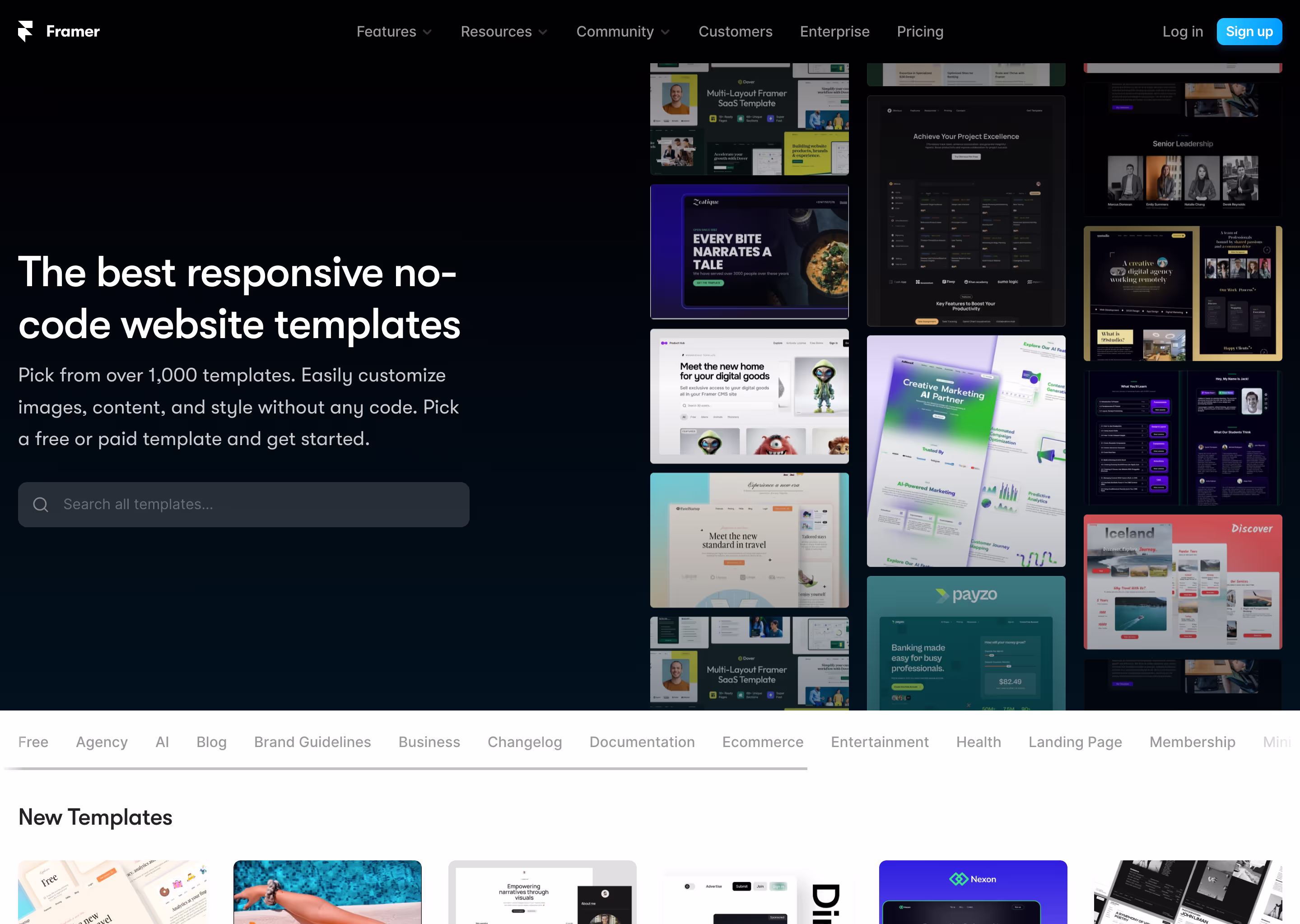
Market: Getting More Creative
One of the most important parts of Framer is the Marketplace, which has many connections, styles, and apps. This SaaS tool lets users improve and customize their design experience, showing Framer's dedication to being flexible and giving users power.
.avif)
8. Shopify
Leading the way in e-commerce
Shopify has become a name that everyone knows when they hear the word "e-commerce." It gives businesses a complete way to make online stores. The fact that its saas site is easy to use and quick shows how it handles online shopping.

Navbar
Like the best SaaS websites, Shopify's navbar is made to make it easy to move around. This lets users quickly check out all of its main features, from setting up a store to using complicated e-commerce tools. It shows how much Shopify cares about making the user experience easy and smooth.
Marketplace
The Marketplace on Shopify is one of the most important parts of its platform. It makes it easy for users to add shopping features to any platform. It's a place where sellers and buyers can meet, which shows how Shopify has helped e-commerce grow beyond its usual limits. The Marketplace Kit makes it very easy to set up a basic marketplace very quickly. This is in line with Shopify's focus on speed and efficiency in e-commerce development.

9. Zap it!
Automating processes to make them more efficient and effective
Zapier is a leader in automating workflows. It does this by linking many apps and mobile devices to its cloud storage, which makes merging and automation easy. Its SaaS site is a shining example of how features and ease of use can be combined.

Navbar
The navbar on Zapier is a well-organized way to get to all of its features. It has sections like "solutions by role," "workflow," and "company size," and it's made for marketers, business owners, IT workers, and more. This shows how flexible and useful the platform is in many situations.

Help and resources
In addition to the usual blog and learning materials, Zapier's "Resources & Support" area has a lot of events, webinars, customer stories, and other materials for a wide range of jobs and processes. This large database of information gives users the freedom to explore and make the most of the platform's features.

Pricing Page
Zapier's price page shows that it wants all of its users to be able to use it.
There is a free plan for simple automation needs and more advanced plans for multi-step automation. The price structure is flexible to meet the needs of all users, providing safe and dependable automation solutions at all levels.

10. Butter
Making virtual collaboration better
Butter is the start of a new age of virtual and communication software. It has tools that are meant to make online meetings as smooth as butter. Its website shows that it believes in this goal by giving users a smooth experience, which is something that all the best SaaS websites do.
Navbar
Butter's navigation bar is well-organized and leads users to a number of features that make working together virtually easier. It shows all the different features Butter has to offer, from planning the schedule to participation tools and AI-powered summaries, so it can be used for a wide range of virtual collaboration needs, such as workshops, trainings, and meetings.

Resources: Giving Users the Power of Knowledge
Users can find a lot of useful information on Butter's website in the "Resources" area. It has movies, blogs, and a community site that give you information about tools and tips for facilitation. This part is very helpful for people who want to get better at working with others online.

Pricing
The price page for Butter is simple and gives clear information about the different plans that are offered. The main page doesn't go into much detail about these plans, but they probably meet the needs of a wide range of users, from people to bigger businesses, making sure that everyone can access and use them.

11. SellX
Increasing market dynamics and sales engagement
SellX is changing the way people buy things and interact with businesses by mixing a strong sales platform with an independent market. Its website follows this creative approach by making it easy to find your way around and giving you lots of information about its main services and features.
Navbar
SellX's navbar does a good job of showing off its best features, like its Power Dialer, Smart Emailer, and unique Freelance Marketplace. These key features are meant to meet a range of sales needs. They show that SellX cares about its customers and offers flexible and useful sales solutions.

Solutions
There are specific choices on SellX's website, such as Market Research and Outbound Sales, in the "Solutions" area. This customized approach to getting new customers and managing existing ones also shows that SellX understands the needs of different markets and is committed to solving specific sales problems in the best way possible.

Pricing
There are clear and simple pricing options at SellX, with deals for people and businesses of all kinds.
The price information includes charges "per seat per month," which shows how flexible and scalable the platform is.
Besides that,
SellX has a special Freelance Marketplace where companies can find experienced sales people to help them grow their teams by doing things like cold calling, emailing, and reaching out on LinkedIn. This makes the platform even more useful for a wide range of sales tactics.
12. Method

Easy Business Management Center
Method's website is both complex and easy to use, which fits with the company's goal to make business processes easier.
It's designed for small to medium-sized businesses and has an easy-to-use interface for its many CRM and business management tools. This is what makes it one of the best SAAS websites.
The best SaaS websites probably have a clean look, clear message, and a focus on the user experience. This is similar to how the Method software works: it is quick and easy to use.
Navigation

Like most of the best SAAS websites, this one will have a sleek, easy-to-use menu bar near the top of the page that makes it simple to get to important parts like Features, Pricing, Testimonials, and Support. TheBottom of the menu would be streamlined and responsive, so surfing would beBottomh on any device.
Bottom

At the bottom of the Method page, there would be a list of useful links. It would make it easy to find important links like Legal Terms, Contact Information, and Social Media. The layout would be simple, making it easy for people to find more tools, information about the company, or Customer Reviews and Case Studies Clients

Imagine a page called "Client Testimonials." This page would show real-life examples and recommendations from companies that have used Method and found it helpful. The website would be well-designed and have interesting pictures and words. It might also have short video reviews and case studies. This method not only gives possible customers social proof, but it also helps them see how Method has helped other businesses in the same field.
Overall, the Method website would be a great mix of good looks and useful features, made to give users a smooth and helpful experience that shows how dedicated they are to using technology to make business management easier.
13. Tranch

Making financing easier for businesses
The Tranch website is probably a good example of an easy-to-use and helpful website for businesses looking for new ways to get money. Tranch's goal is to make the financing process easier for businesses of all kinds, so the style is likely to be modern and professional, with a focus on clarity and ease of use.
Navigation
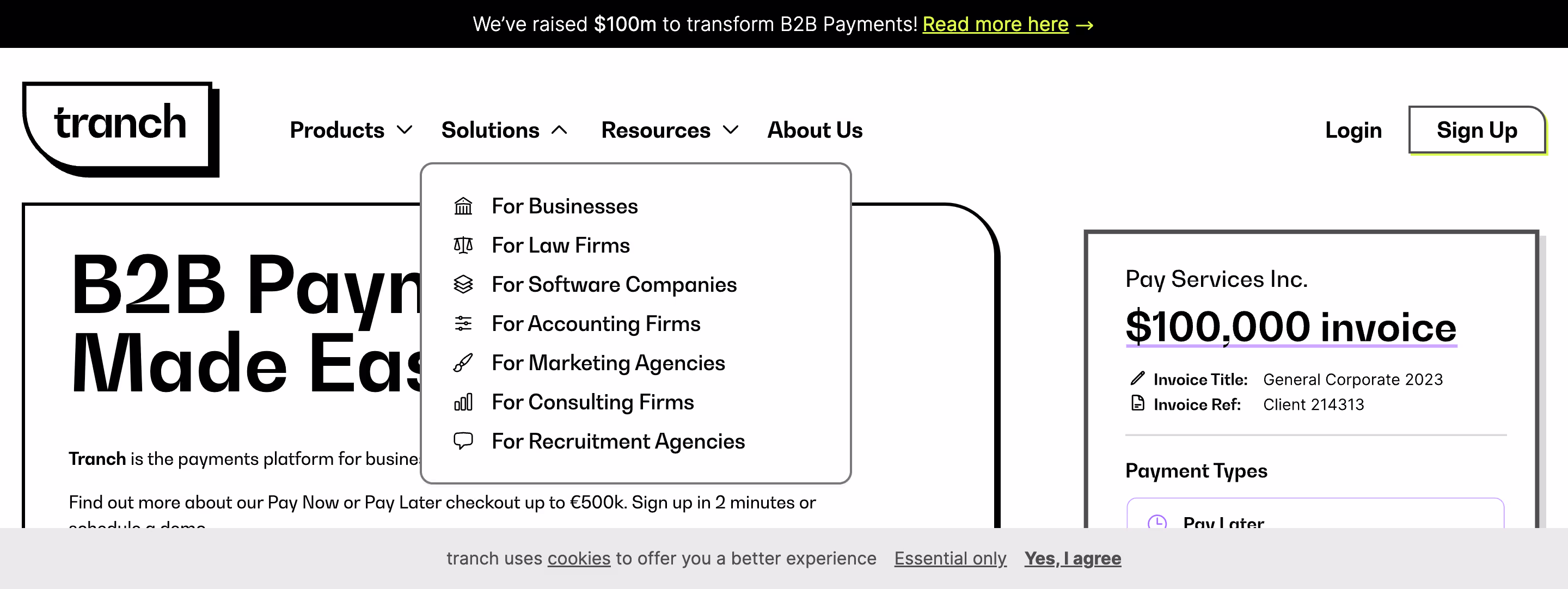
People would expect the Tranch website to have easy-to-use navigation that makes it simple to get to important pages like Services, About Us, Client Success Stories, and Contact Information. The menu bar would look nice and be simple to use, making it easy for people to find the information they need.
Footer

In Tranch's site, the bottom, which has links to important pages like FAQs, Legal Information, the Blog, and Social Media Profiles, is likely to be a complete source of information. The layout would be clean and easy to use, making it simple for users to find extra tools and information about the company.
Page with New Financing Options

Imagine a page called "Innovative Financing Options." This page would probably explain Tranch's unique way of financing businesses by showing off the different services and options they offer. It could use interesting images, dynamic features, and short text to make complicated financial ideas easy to understand. The goal would be to teach potential customers about the benefits of using Tranch for their financial needs in a way that is both interesting and useful.
Overall, the Tranch website would be a great mix of professionalism and user-centered design. It would aim to make the process of looking for business funding as easy and helpful as possible, which fits with their mission to simplify and transform business finance.
14. Basecamp
Making project collaboration easier
Basecamp's saas website is probably a shining example of how well it works and how easy it is to use. This is fitting since Basecamp is a complete project management tool.
The style would be fun and easy to use, making it perfect for businesses and teams that want to make working together and staying organized easier. The site probably has a clean, modern look and clear message, which makes it easier to navigate and understand their services than other SaaS websites.

Navigation: Project Navigation Without Any Trouble
Basecamp's website's menu bar should be easy to use and give you quick access to important areas like Features, Pricing, Case Studies, and Support. The style would probably be simple and clean, with the goal of making it easy for users to find what they need. This would be in line with how easy and useful the Basecamp tool is.

Footer
Basecamp's website's bottom could be used as a complete resource because it neatly arranges links to more information about important parts like User Guides, Company Blog, Privacy Policy, and Job Openings. It would be made to be easy to get to so that people can easily find out more about the business and what it has to offer.
15. Spline

Getting Design Creativity Going
Compared to other 3D design SaaS websites, Spline's website is probably full of creativity and new ideas, which fits nicely with its purpose as a 3D design tool.
The site probably shows off current web design techniques that focus on making websites visually interesting and easy to use. It would be perfect for designers and artists because it would be easy to use and give them ideas for how to use Spline. It would have a sleek, modern look and be easy to navigate.
How to Get Around: The Design Journey Made Easy

Spline Navbar
Spline's menu will be a work of art in how simple and beautiful it is, making it easy to get to important areas like Features, Gallery, Tutorials, and Pricing. The menu bar would probably be simple but useful, leading people through the whole website easily, just like Spline wants to make the 3D design process easier.
Footer: A Way to Get More Creative

Spline Pad Footer
The bottom part of Spline's webpage would be a well-organized place to find resources. It would likely have clean, easy-to-find links to all of your contact information, social media pages, frequently asked questions, and legal terms. This part of your website would make it easy for people to find more information, stay in touch, and learn more about your business.
Community Creations Page: Honoring Group Creativity

Imagine a starting page called "Community Creations." This page should have a lively collection of works made by Spline users that show how flexible and powerful the tool is. It could have a collection of 3D drawings, user reviews, and case studies to get people excited about Spline and show how much of a community it has. With interactive features and styles that look good, this website would be more than just useful information; it would also show how creative Spline can be.
Basically, the Spline website should be a beautiful and easy-to-use platform that shows off the creative spirit of the tool it represents. It would be made to engage tourists, inspire them, and teach them about the possibilities of 3D creation. It would be the perfect example of how Spline combines creativity with ease of use.
16. Story of

Making Insights Out of Data
Chronicle's website is probably a lively and useful platform, which fits with its role as a cutting-edge tool for business information and data analytics. People and companies looking for strong data analysis tools will be able to use the design, which should be sleek, professional, and focused on the user. The website would have a modern look and clear, simple text, so people could quickly find their way around and understand the services it provides.
Data navigation has been made easier.

Chronicle's website's search system would be made to be clear and simple to use. It's important that important parts of the site, like Solutions, Features, Case Studies, and Support, are easy for users to find the information they need quickly and easily. This easy-to-use interface would show that Chronicle is dedicated to making data analysis simple and easy to get to.
Footer: Complete Library of Information

The bottom part of Chronicle's website would probably be a great place to find a lot of information. It would carefully order links to important pages like User Guides, the Company Blog, the Privacy Policy, and Contact Information. The style would be well-organized and simple to use, making it easy for people to find more information and tools and learn more about the business.
Features Page: It's Easy to Decode Data

Imagine a page called "Advanced Analytics Features." This page should describe all of Chronicle's advanced analytics features, such as predictive models, data display, and real-time analytics. To make these complicated features easy to understand, it might use a mix of infographics, live demos, and short descriptions. The point would be to show how powerful and adaptable Chronicle's tools are at turning raw data into insights that can be used.
Overall, the Chronicle website should be a nice mix of professional design and easy-to-use features, with the goal of giving users a smooth and educational experience. As part of Chronicle's goal to make data analytics less mysterious and more useful for both businesses and people, this would fit in well.
What ought to a SaaS site have?
Interface that is easy to use
A SaaS website should put the user experience first. A clean, easy-to-use design makes it easy for website users to find what they're looking for. To keep potential buyers interested and lower bounce rates, design that is clear and easy to use are musts.
A lot of information about the product
It's important that the information about your offering is clear and easy to find. This includes clear price, perks, and descriptions of features. Good images and movies can help people understand and be more interested in what you have to give by giving them a full picture.
Powerful Call to Action
Call-to-action (CTA) buttons that work well lead people to trial sign-ups, demos, or contact forms. They should be put in a way that makes them stand out and makes people want to take the next step in their potential customer path.
Testimonials and Case Studies
Customer reviews and case studies on SaaS websites help build trust and trustworthiness. They show how your product has been used and how well it has worked in real life, giving potential buyers useful information.
Quick to respond and load
All devices must be able to respond to and quickly load a SaaS page. It's just as important for your site to work perfectly on phones and tablets as it is on desktop computers in today's mobile-first world.
Which tool is the best for making a SaaS site?
Webflow gives you unmatched design freedom.
When making a marketing website for a well-designed SaaS website, it's very important to be able to make a design that is both unique and interesting for the target audience.
This is where Webflow really shines.
Unlike platforms that are limited by rigid templates,
Webflow gives you full design freedom to make great SaaS websites. This means that you can make your SaaS website fit your brand's style and meet your unique goals for the user experience.
Integration and compatibility without any problems
One of Webflow's best features is that it works well with many tools and apps that are important for SaaS systems.
Your website can be a hub for your SaaS business because Webflow works with many plugins and APIs. This includes marketing automation tools, e-commerce platforms, CRM systems, and analytics. This makes your business run more smoothly and improves the user experience.
Design and Performance That Are Responsive
In the SaaS business, how fast and easily your website responds are very important.
Webflow promises that your site will not only look great, but also load quickly and work well on mobile devices.
Strong hosting and safety
For SaaS websites, security and dependability are musts. Webflow's strong hosting SaaS options and security features meet this need. Your SaaS website will be fast, safe, and reliable with Webflow because it has built-in SSL, regular backups, and a high-end server infrastructure.
The Last Quote
"In the digital realm, the right platform can transform ideas into realities. With Webflow, the potential of your SaaS website is limited only by imagination."


